
Objective Analysis II
[Ebal, twenty-four of thirty]
We test here the first part of Haughwout’s material fact, that is whether the tablet contains proto-alphabetic letters.
To evaluate this I take these steps:
First I outline Haughwout’s position. Find this below the magenta banner.
Against it, I give push back. This you find below the yellow.
Lastly, I announce my findings below the purple banner.
I am Ernie Vallery, a retired Louisiana attorney living now in South Coast Massachusetts.
This is my twenty-fourth post insisting that the proposed Joshua’s Altar and the Mt. Ebal Curse Tablet deserve a chance to prove what they might be. To start the journey from its beginning click here. Otherwise, drive on.
No Letters
When Haughwout began to study the photos of Stripling’s article, he had an initial favorable impression. The top right corner indeed seemed to show several proto-alphabetic characters. Namely these were Teh, Meh, He, Teh and Aleph–five in total, respectively #’s 18, 19, 12, 20, and 21 of Figure 7.
For him the most impressive was Aleph #21. Best he felt it displayed the appropriate proto-alphabetic characteristics.
His opinion, however, soon changed.
On close review he noticed a number of crack lines commencing from the tablet’s edge to intersect with the character.

Is there an “Aleph”?
Photo by Jesu00fas Esteban San Josu00e9 on Pexels.com
Prominent were the two cracks that he deduced had over time created the “Ox’s” horns. (See here.)
Resultantly, this Aleph’s favorable status crumbled. He deduced it only the chance product of crack lines. No longer was it an exquisite inscription. It now presented a coincidental aberration with grotesquely proportioned horns. This disqualified it as a man-made proto-alphabetic letter.1
Disillusionment followed also for the other four likely script candidates. All he concluded as being mere happenstance cracks, scratches, and dents in the lead.
Some of the primary reasons for this were these:
- First, he realized how small these characters were, ranging form .01 to .05 mm. The minimalist crack, scratch, or dent could replicate them; and
- Photos of bulges on the tablet’s bottom (Table 10) failed to impress Haughwout. These Stripling had presented as negative proofs of inside characters. They too, Haughwout concluded, likely resulted from cracks, scratches and dents.
Haughwout thus finally surmised that his most favored of the tablet’s characters presented major existential problems. Doubly so this applied to the remainder.
Pushback on Haughwout’s Improbable Letters
I. Lovely Aleph
Haughwout notes that initially “Aleph, ” Figure 7, # 21 presented for him as a gorgeous proto-alphabetic inscription.
On this I agree.
Note its beauty! It satisfies the eye as an elegant calligraphy beginning a chapter of a medieval manuscript.
See Table 2 (3 a and b). What do you think?
Haughwout, however, finds what he considers a fatal flaw–crack lines intersecting the horns.
These he concludes reveal the inscription to be nothing more than happenstance cracks, scratches, and dents. (See again Haughwout’s illustration.)
But Dr. Pieter van der Veens of Johannes Gutenberg University Mainz, one of Stripling’s team epigraphers and an expert in ancient Near Eastern languages and inscriptions, gives a plausible explanation. He suggests that yes there are crack lines emanating from the tablet’s edge. But likely the force of the stylus so close to that edge caused this.
In fact, along the tablet’s top this “Aleph” is among the closest.2
Note too that Haughwout’s drawing appears on a photo that poorly focuses this Aleph.”
Look instead at Table 2, (3 a).
On this clearer image you can see that the cracks do not intersect the horn tips smoothly and directly. On both horns there is a transition from the points where the aesthetically pleasing horns end and the apparent cracks intersect.
Both of the aesthetic horns are darker, wider and likely deeper.
Plus, at the intersection points the direction of the cracks deviate on both, but on one more pronounced than the other.
The above emphasizes the likelihood of an author having beautifully crafted his letter only to have time mar it with the imperfectly connecting cracks.
II. Tiny Letters
Haughwout also complains about many of the letters’ small sizes. Here the simple explanation is that the author had a small space with which to work. Plus, in that small space he had a serious message to convey–one not intended for human eyes but only for God.
Fortunately, though, they are indeed visible to man.
III. Bottom Bulges
Further, Haughwout apparently scoffs at the idea of negatives on the tablet’s bottom , “Outer B”, replicating inner tablet letters.
This evidence surely deserves less flippant appraisal.
Consider these examples:
- Compare “He” of Figure 7’s, #3 and Table 3, (4 a and b) with Table 10, photo #2. This image I have designated “Dancing ‘He’”. Why? Notice that his arms and legs, seemingly in motion, occupy different levels. Nevertheless, the positive of the inner tablet and the negative of the tablet’s bottom mirror.
- See, the first “Resh” in the word “ARWR”, at Figure 7’s #26 and Table 8, (2a & b). Compare it with the bottom bulge shown at Table 10, #8. Notice how they coincide. The positive inner image slants right.The bulge mirrors to the left.
- Compare also the “Waw” of Figure 7’s, #13 and Table 4, (1a and b) with Table 10, photo #4. Are these not both mace representations?
- Similarly compare the “Mem” of Figure 7’s, #19 and Table 7’s, (1a & b) with Table 10, #7. Do they not represent waves of water associated with this character?
- Possibly most important is the “Yod” of Figure 7’s, # 11 and Table 5, (1a & b) compared with that in Table 10, photo #3. Both are admittedly faint.
- Yet even faint mirroring reflections have an important ramification, one that Haughwout recognizes. He notes,”The reality is a dent on one side of a 0.4 mm thick piece of lead will of course appear on the opposite side.” Further he continues that this proves that the marks “on the inside are indeed there and are not x-ray anomalies.” In other words even where the mirroring images are faint, they prove that what is faintly depicted is indeed there. It is not some fluke produced by x-ray or photographic lightings or shadows.3
Several factors limit the possibility of these being the result of mere happenstance cracks, scratches, or dents.
Note that of the three, a dent seems most likely. Usually such one associates with sufficient downward force to cause an opposing bulge.
Nevertheless, Haughwout’s contention that a happenstance dent as opposed to a purposeful one caused by an inscriber’s stylus must account for the following:
- First, the tablet was closed thus protecting the inner tablet from further damage.
- Second, the tablet’s top,” Outer A,” does not have marks corresponding to these negatives. Only our inner tablet marks do.
- Third, therefore, the force, possibly by a stylus, was likely applied before the tablet was closed.
- Fourth, this closing likely occurred during the Late Bronze Age to Iron Age II– the era of proto-alphabetic writing.
- Fifth, the act of closing was likely done purposefully by a human. Likely too that was done to conceal and protect a message hidden within.
All of the above amount to justifications for a reasonable person genuinely disputing this portion of the material fact addressed here, namely, that the tablet does not reveals proto-alphabetic script.
This portion of Haughwout’s material fact thus fails to support his refutation claim.
Improbable Letter Finding
The evidence shows that there is a genuine dispute about Haughwout’s proposition here. In other words, a reasonable person can genuinely dispute the claim that there are no proto-alphabetic letters on the tablet.
Despite conceding that Figure 7’s #’s 18, 19, 12, 20, and 21 represent proto-alphabetic forms, Haughwout nevertheless concludes that only coincidental cracks and dents formed them.
Yet, a reasonable person could genuinely counter that:
- “Lovely Aleph”, Figure 7, # 21, is likely a scribe’s work marred somewhat by incongruous intersecting cracks radiating from the nearby tablet edge.
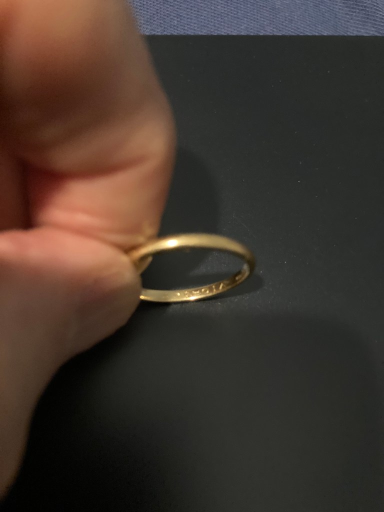
- The fact that the letters are small is of little consequence. My wedding band has my wife’s name etched inside it. They are comparably as tiny but no less visible, real and meaningful.
- The bottom negatives legitimately argue of man-made proto-alphabetic script inside the tablet.
Therefore, Haughwout’s improbable letter arguments do not support his “refutation” claim. Against this part of Stripling’s first material fact he has failed to satisfy our objective test, that is, that a reasonable person could not genuinely dispute the absence of proto-alphabetic letters on the tablet.
Might another of his arguments fare better? Next up we will examine the first of his “Improbable word” criticisms, namely, against “ARWR”–“You are Cursed!”
Thank you for reading!
If you appreciate this type of analysis, please “subscribe”, “like”, and “share”.
If you wish to support this work, you can do so in the donation section below. Such really encourages!
Next post: “ARWR?”
- Haughwoout, M. S. Mt. Ebal curse tablet? A refutation of the claims regarding the so called Mt. Ebal curse tablet, Herit Sci 12, 70 (2024). htts://doi.org/101186/s40494-023-01130-z, paragraph 16. ↩︎
- Id. paragraph 17. ↩︎
- Id. paragraph 56. ↩︎
Make a one-time donation
Make a monthly donation
Make a yearly donation
Choose an amount
Or enter a custom amount
Your contribution is appreciated.
Your contribution is appreciated.
Your contribution is appreciated.
DonateDonate monthlyDonate yearly

Leave a comment